Case Study
UX
Giving Admins a Faster Way to Send Real-Time Water Alerts
Brand
Water Utility (USA)
Product
SaaS - Web App
My Role
UX Designer (Agile)
Time
2024, 2025
At a Glance
01
Real gap, not assumed
residents still complained when supply changed unexpectedly. The real need was a real-time alert, sent at the moment of action.
02
Designed for pressure
Stakeholder interviews revealed admins feel nervous sending live alerts — a mistake reaches residents immediately. The design had to work for someone unfamiliar with the tool and under time pressure.
03
Reframed from the client's own insight
The client only sends alerts right before valve operation — so admins don't need a start and end time. A duration field replaced two inputs with one.
04
Shipped as MVP Phase 1
The broadcast feature was delivered as part of the live product. The duration input reduced the fields Susan needed to complete from two to one.
05
Client assumption challenged by research
The client initially envisioned a WhatsApp-style interface. User research showed this would blur the line between a one-way alert and a direct message — the final design kept simplicity while making the broadcast nature unmistakably clear.
The Snapshot
Background
The client is a small water utility supplying local homes. Despite sending advance emails about planned maintenance, admins were still receiving resident complaints when water cut off or returned unexpectedly — because emails sent days earlier weren't enough warning in the moment.
I was tasked with designing a real-time alert feature for system admins — delivered as MVP Phase 1 of a broader SaaS product.


Challenge
How might we help system admins inform water users just before supply changes occur?
Solution
A simple tool that allows admins to send “water off/on” message in a few clicks.
WWWA already notifies users a few days in advance about planned outages, adding a real-time message just before the water is turned off or back on helps reduce confusion, inconvenience and frustration.
User & Stakeholder Research
Many admins are volunteers from the community. They need something that feels intuitive to use
Through structured interviews with stakeholders, we found that many WWWA admins are local volunteers — they care about the community but don't always feel confident using digital tools. The product needed to work intuitively, even without training, because admins change with no formal handover.
Sending a live alert adds another layer of pressure. Admins know the message goes out to
real residents immediately — and that a mistake or delay has a direct impact on people's day. Even confident users described feeling nervous when time was tight and the water supply was about to change.
The design needed to work for someone who is both unfamiliar with the tool and under pressure to act fast.


Susan Roy
System Admin @ water utility
Susan is not very tech-savvy, but she’s open to learning. She wants to help manage water-related messages, but she gets nervous, especially when time is tight and the message needs to go out quickly.
Goals
Send messages on time
Avoid mistakes and errors
Send messages confidently
Pains
Unfamiliar to computers
Small elements on screen
Unclear wording
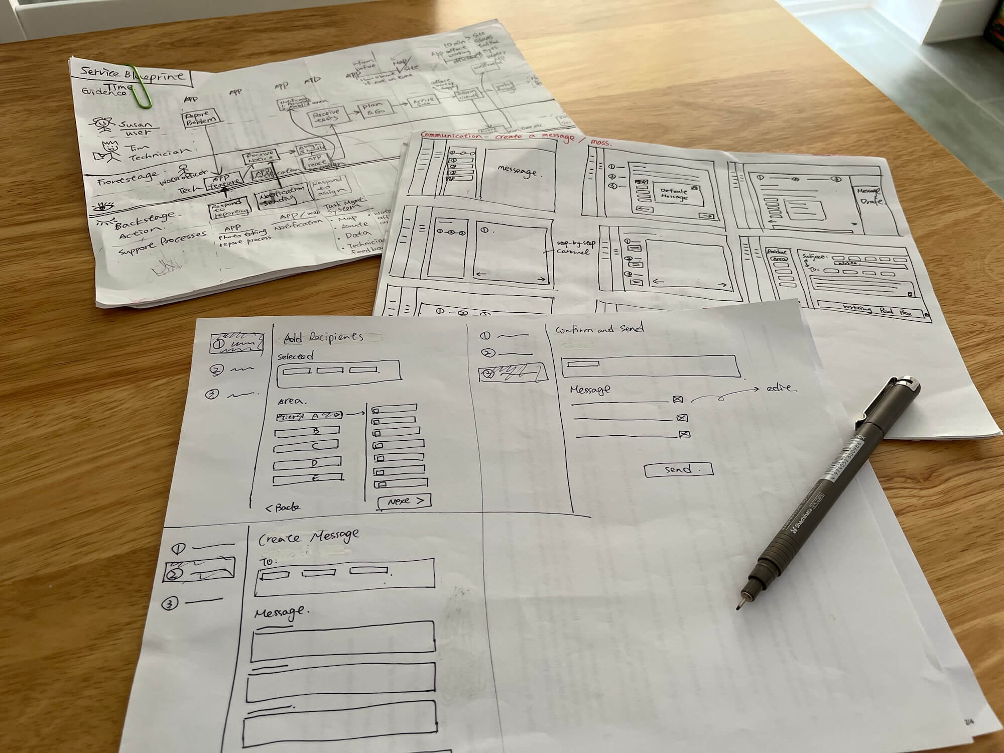
Ideation
The design is built around one constraint:
Susan needs to send an alert in seconds, under pressure, without making mistakes

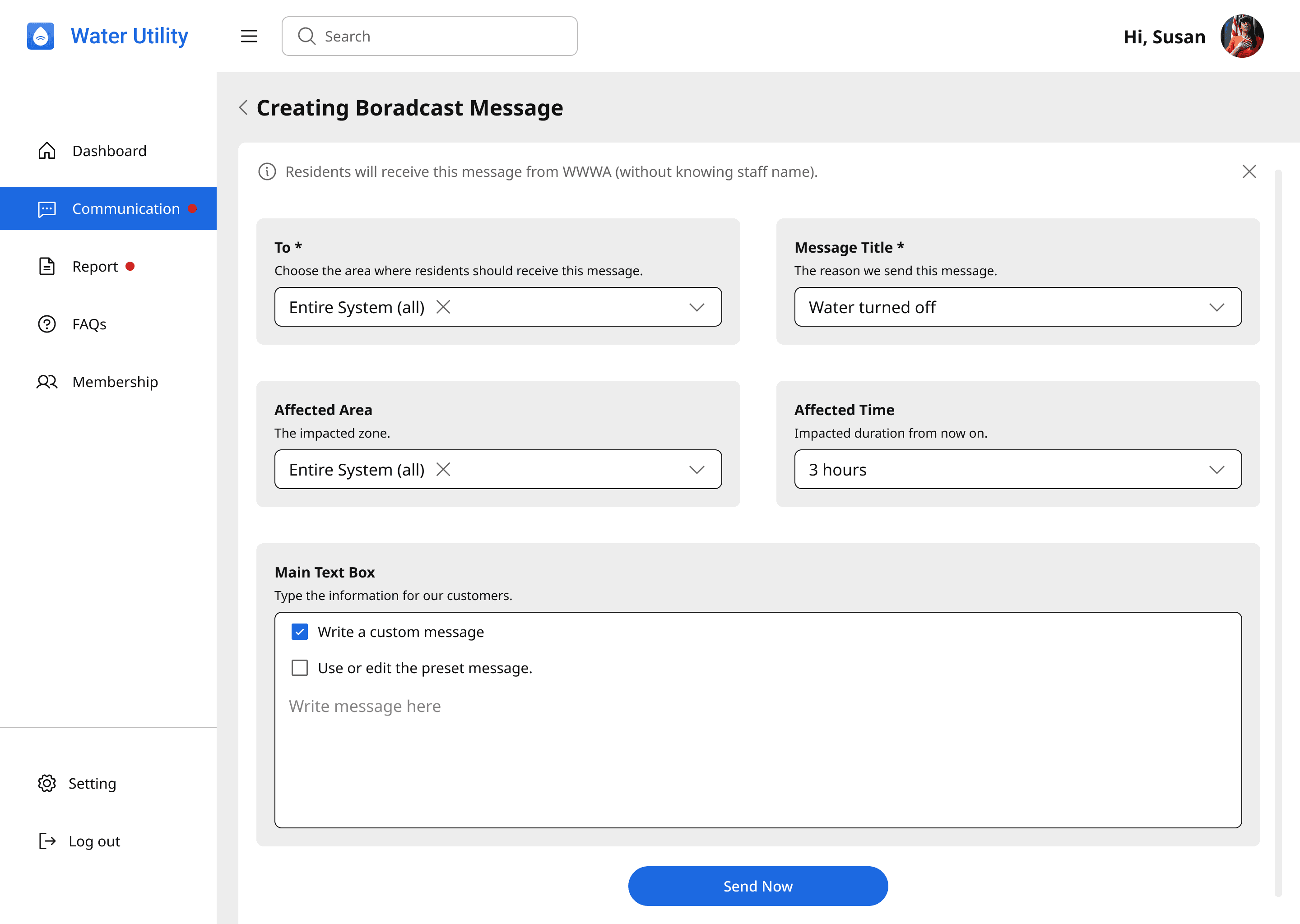
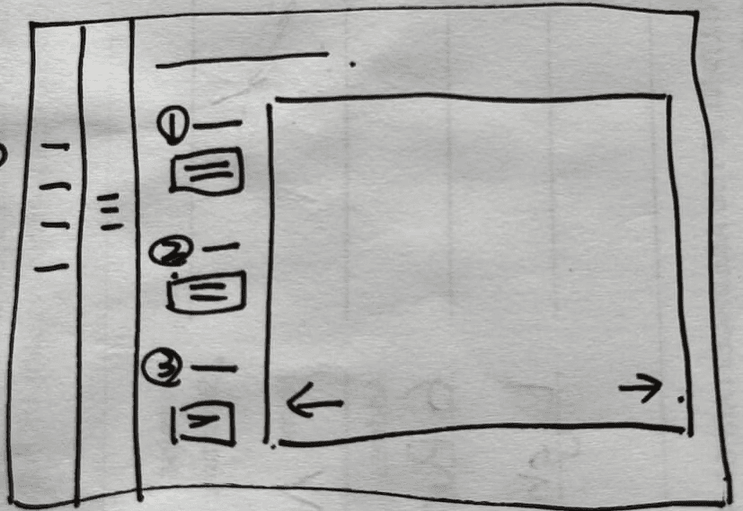
Everythinig on one screen
Susan sees the full process at a glance, nothing hidden behind steps
Dropdown options instead of free text
Removes typing errors for time-sensitive messages
Three preset message types
Water off, Water on, Custom — minimal decisions required before sending. Editable as well!
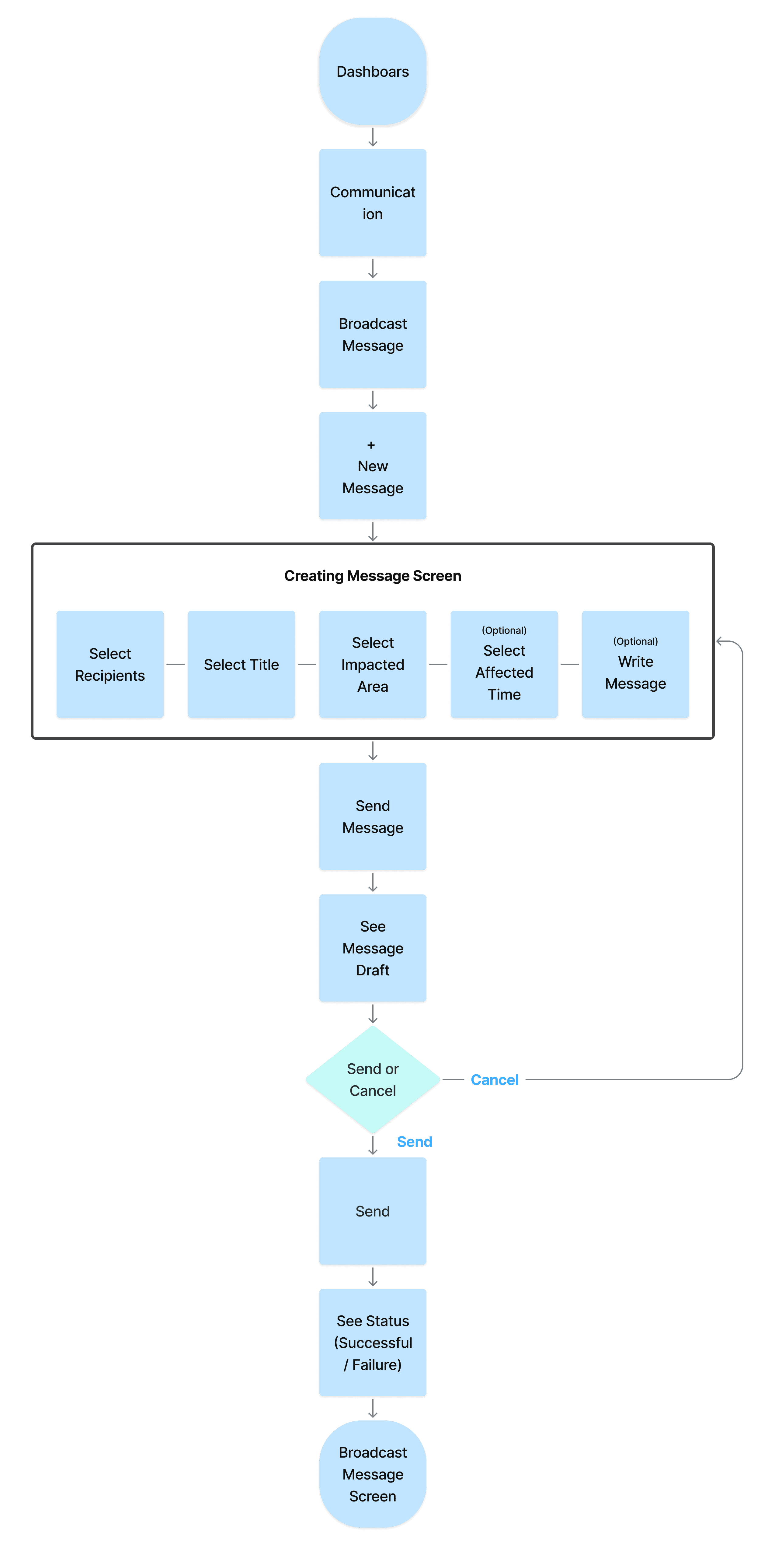
User Flow
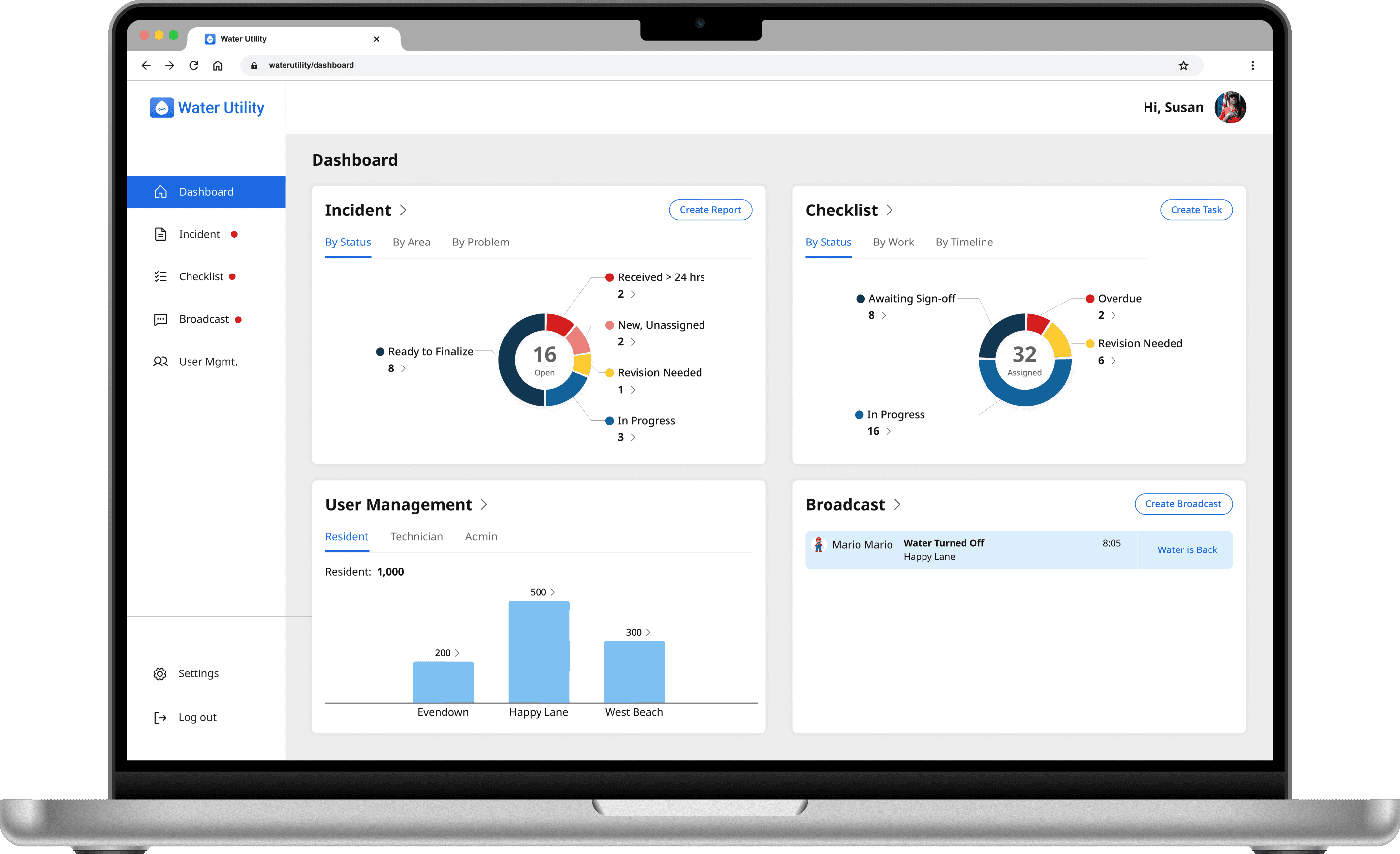
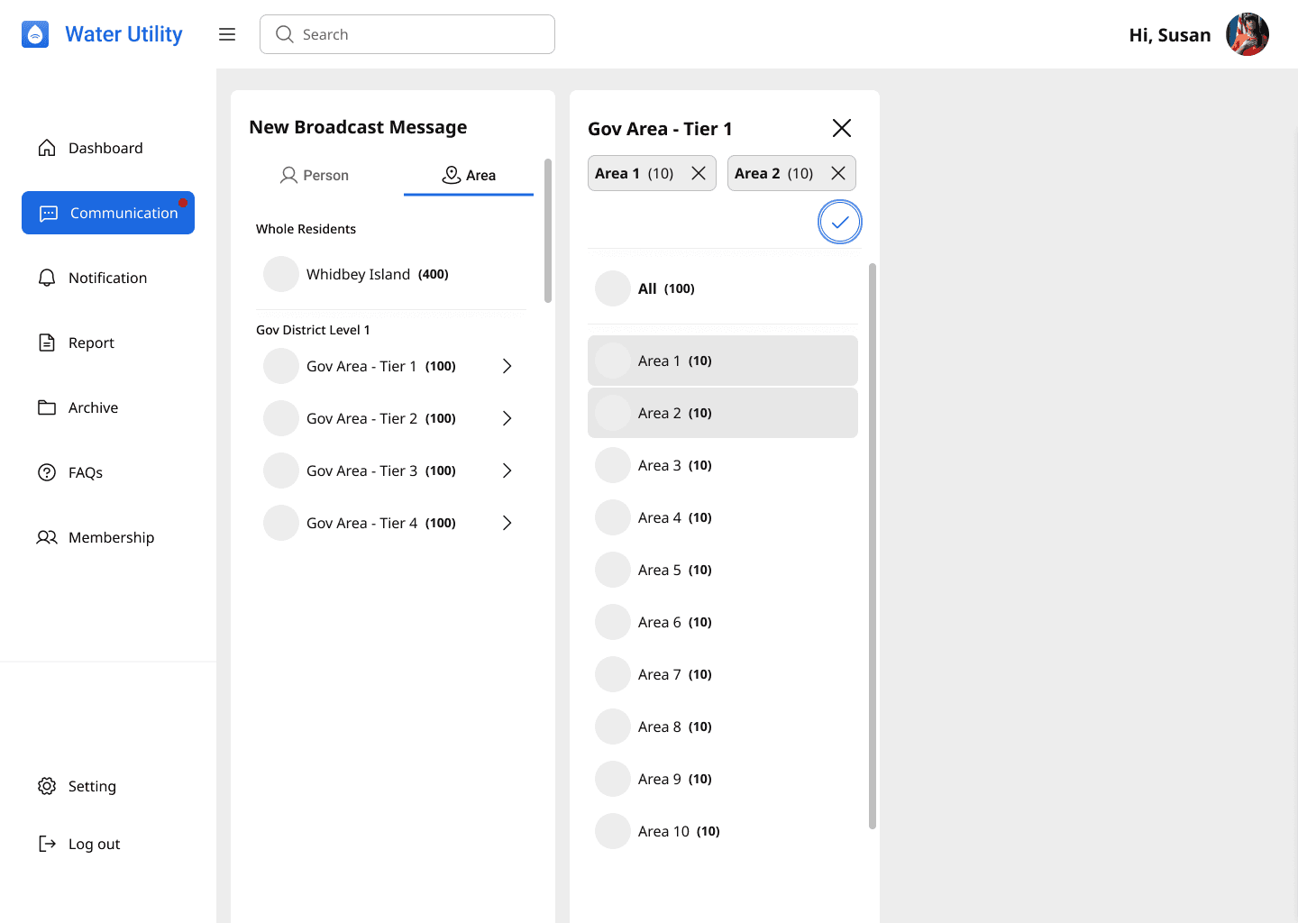
Journeys from dashboard to sending alerts

Iteration
A better way to select affected time
Based on stakeholder feedback, WWWA only sends “water off/on” alerts right before the valves are operated. This meant there was an opportunity to simplify how admins enter the affected time.
Instead of selecting a start and end time, Susan can choose a duration instead.
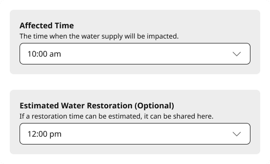
Instead of selecting a start and end time separately.
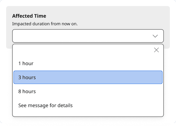
Now, Susan chooses a preset duration, usually 1, 3 or 8 hours according to WWWA.
The most current design
Enabling Susan to send alerts in a few clicks
The broadcast feature shipped as a part of the MVP phase 1. The duration-based time input — introduced after stakeholder feedback — reduced the number of fields Susan needed to complete from two to one.
Self-Reflection
What this project taught me
At the start, the client envisioned a broadcast feature that worked like a messaging app — familiar, conversational, similar to WhatsApp. After user research, it became clear that a chat-style interface would blur the line between a one-way alert and a direct conversation. Admins might hesitate, unsure whether they were broadcasting to all residents or messaging one person.
This was an early lesson in the difference between what a client asks for and what users
actually need. The research didn't dismiss the client's instinct — it refined it. The final design kept the simplicity they wanted, while making the one-way nature of the alert unmistakably clear.
It reinforced something I'll carry into every project: the best products are built with the client, not just for them — balancing their operational knowledge with what research reveals about real user behaviour.