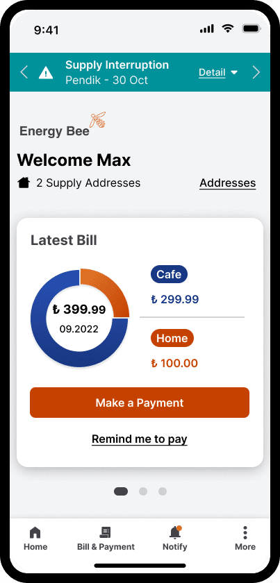
Case Study
UX
Helping energy users prepare for power cuts and manage bills — without the stress
Brand
Energy Bee
Product
Mobile App
My Role
UX Designer
Time
2022
At a Glance
01
User research grounded the design
5 semi-structured interviews revealed that every participant had experienced unexpected power cuts and considered bill stability essential.
02
Two core user needs addressed
Advance warning for planned outages and control over bill payments — both mapped to a single persona with real operational pressures.
03
Tested before finalising
Usability tests with 4 participants across 57 task attempts — 98.2% success rate.
04
Research drove real decisions
The single failure in testing led directly to a site map restructure — Settings separated from Account.
05
Iterated on feedback
Three rounds of changes based on usability test results and professional feedback, including visual hierarchy, reminder access, and navigation.
The Snapshot
Background
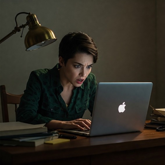
As remote work became the norm, unexpected power cuts started disrupting daily routines in ways that were hard to plan around. Energy users had little visibility of upcoming outages and no easy way to manage bills across multiple properties. I started the Energy Bee project to improve how users stay informed about outages and manage their bills.

Challenge
How might we help users prepare for planned power cuts and better manage their bills?
Solution
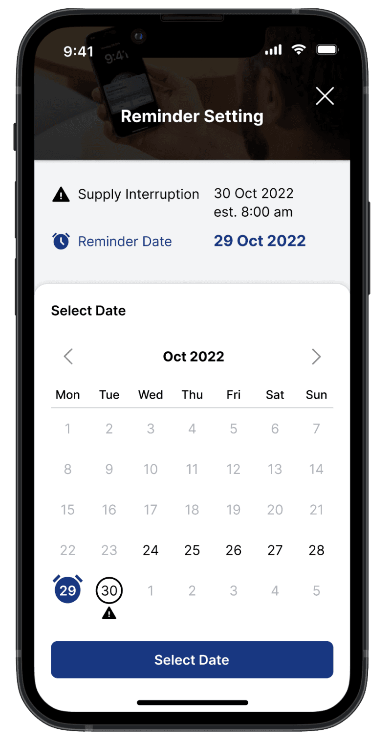
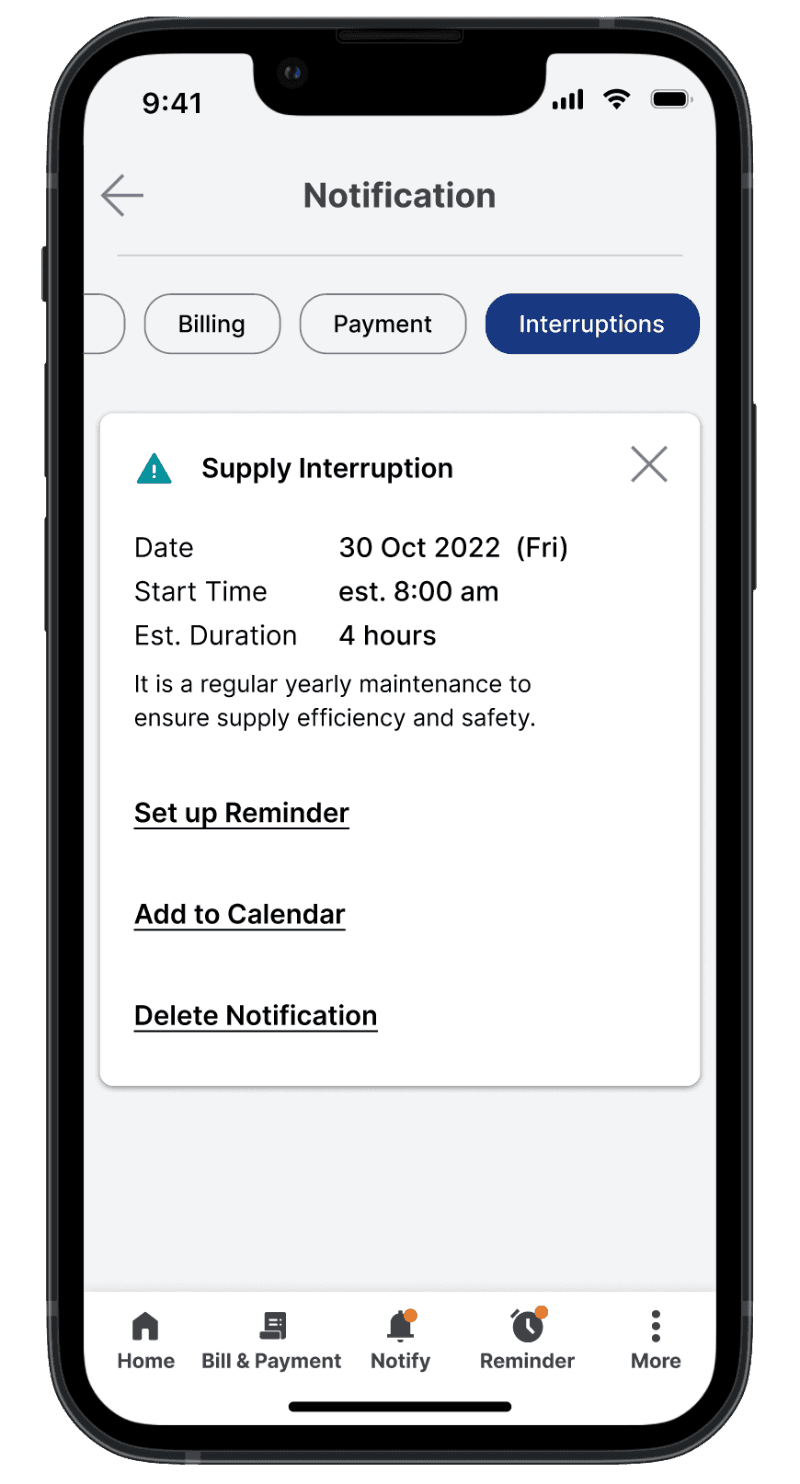
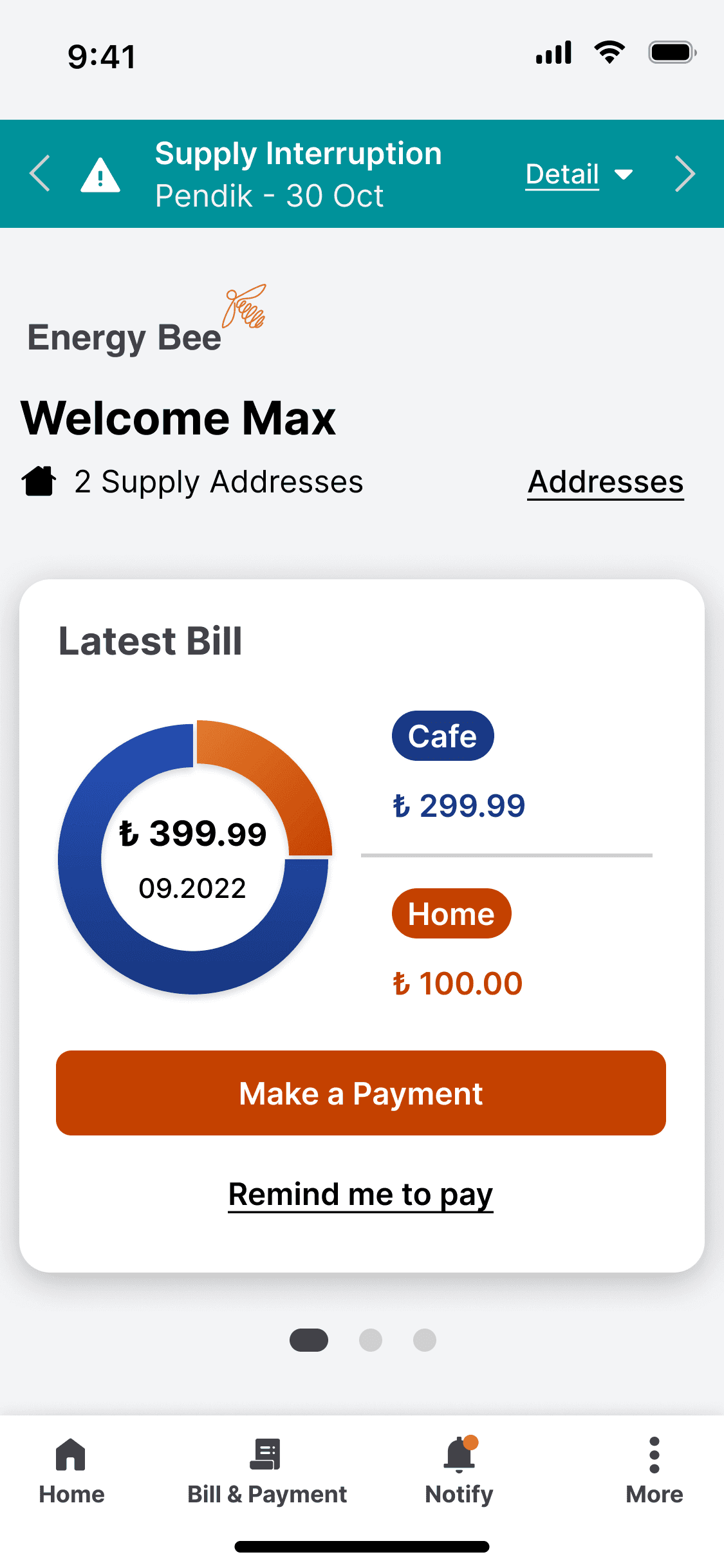
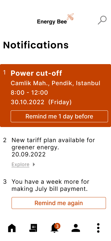
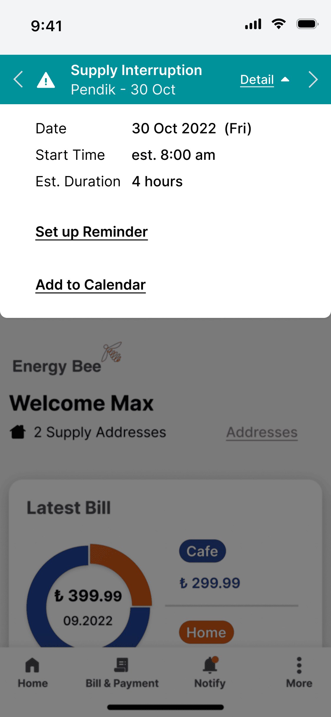
Encourages users to set up reminders, for power cuts and payment.
User Research
Through semi-structured interviews with five participants, who had prior experience in bill handling, I found unstable bills and unexpected supply are mentioned by every interviewee.
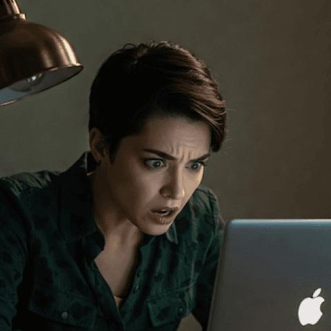
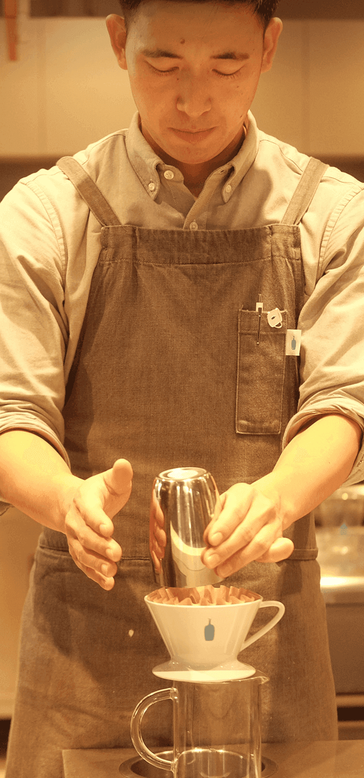
These insights led to the creation of Max, a busy café owner who relies on a stable energy supply to keep his business running. Unexpected power cuts cost him customers. Unpredictable tariffs make financial planning difficult.



"I want to keep my café cosy and professional. Being aware of supply status, cost and profit is essential to me."
Max
Cafe Owner / Barista
37 years old @ Turkey
Max owns a small café. Unexpected power cuts cost him customers. Unpredictable bills make financial planning difficult. He needs an energy supplier that keeps him informed and in control.
End Goals
Run a sustainable business
Provide the best coffee and service
Find balance between home and café
Experience Goals
Reliable energy supply
Consistent tariffs
Stay informed from suppliers
Pains
Unclear and unstable expenses
Sudden power cuts
Juggle between home and business

Reminder Set-Up
Set reminders for upcoming power cuts and bill payment due dates to avoid late fees or supply cut.
Multi-Bill Payment
Pay multiple bills at once, making it easier for busy café owners to stay on top of expenses.
Ideal for users without automated payments, saving time and effort.
Bill Comparison
Compare energy bills across different periods to track and manage café expenses effectively.
Spot unusual fluctuations in costs and adjust energy consumption accordingly.

Usability Test
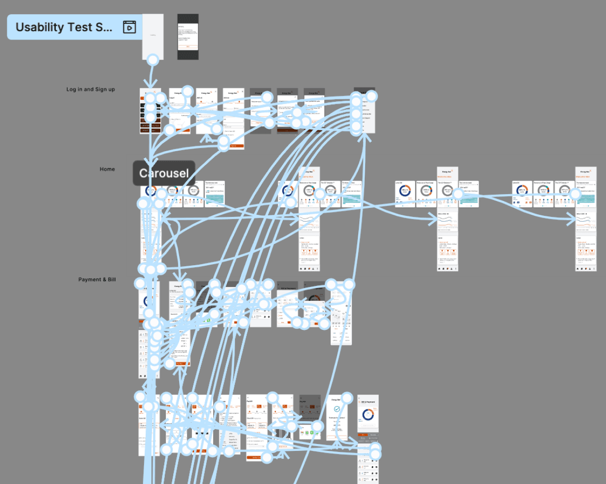
I ran usability tests with four participants — in-person and remotely. They completed 14 tasks across 57 attempts.
98.2% attempts were success among 57 attempts.
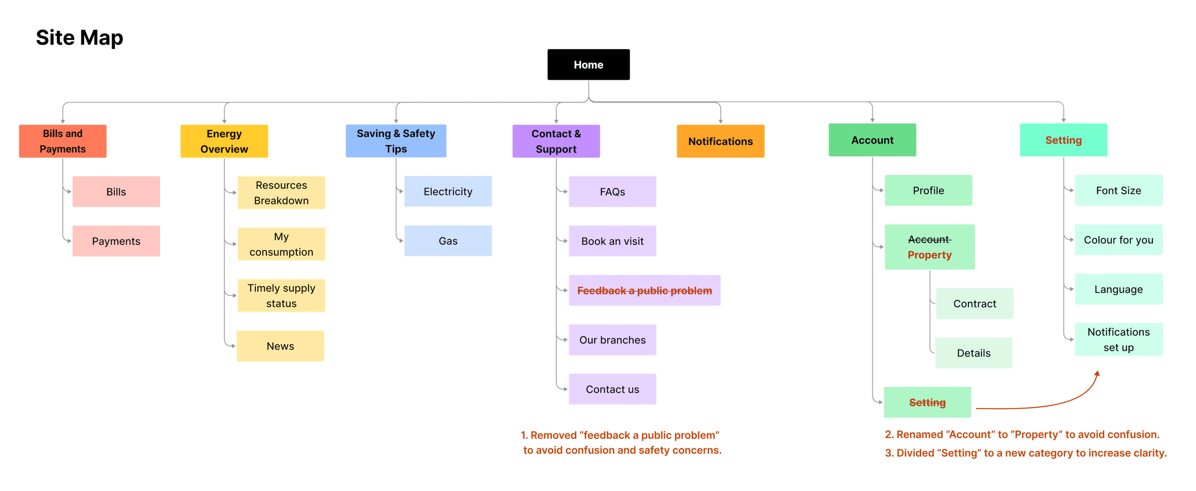
1.7% attempts were failed. The participant mistakenly clicked on "Setting" instead of "Profile" when changing their email.
Solution for the failed results. I restructured the site map, making "Setting" a main category instead of placing it under "Account."
Site map
I separated Settings into its own category and renamed Account to Property — both changes came directly from usability feedback.
The Latest Design
The final design gives Max three things he didn't have before:
Preparedness
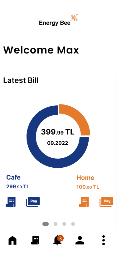
The App encourages Max to set reminders for upcoming power cuts and bill payment, so they can take proactive action in advance.


Financing Planning
Max can easily compare his bills for better budget management, increasing awareness of consumption patterns and cost changes. A year-on-year comparison is available.
Efficiency
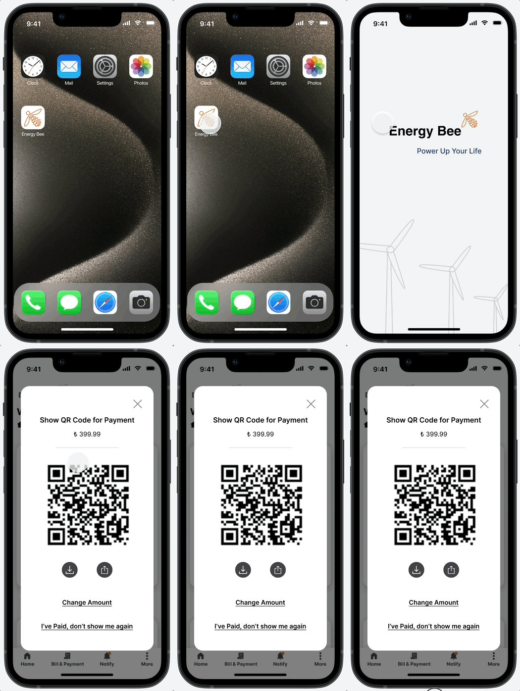
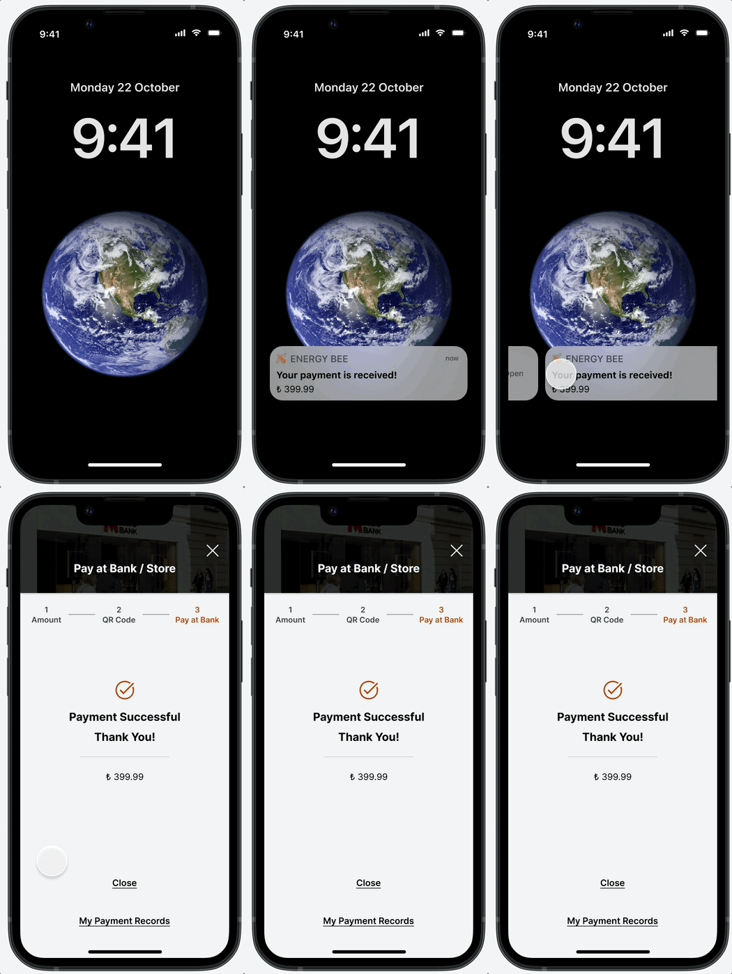
The app allows bulk bill payments, saving valuable time. For store-based payments, Max can generate a QR code and share it with his café staff, allowing them to complete the transaction on his behalf.
Scene 1
Max selects the bills to pay and generates a QR code.

Scene 2
Upon arriving at the bank, he opens the app to access the QR code
Scene 3
After completing the payment, he instantly receives a confirmation
Self-Reflection
What I'd do differently
Starting from the persona's core needs — rather than designing all features at once — would have sharpened the focus earlier. I'd also consolidate to a single persona unless research revealed genuinely distinct user types; two personas with overlapping needs diluted the design direction.
Finally, I'd run WCAG accessibility checks from the branding stage — catching contrast issues early is far cheaper than fixing them in high-fidelity screens.